Intoxination

Tag: graph

Oct 5
2010

Joe Scarborough, Still The Shill

Politics

This morning Joe Scarborough was all giddy touting that George Bush “created 3 million jobs”. This is something I have seen Republicans push for quiet sometime without backing it up with any data. Well that data is really easy to find on the Bureau of Labor Statistics website. First off, here is a nice graph […]

Read More
Apr 29
2010
Figure6med

Looking Into The Left And Right Of Political Blogs

Media

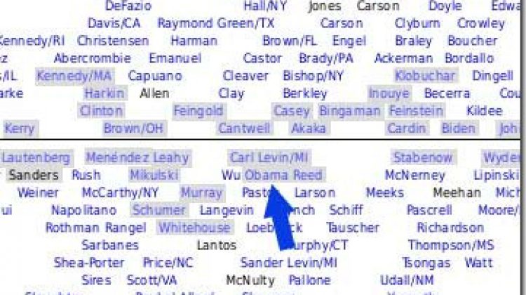
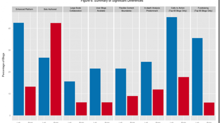
The Berkman Center for Internet and Society at Harvard University has just released a comprehensive report on the differences between the two sides of the political blogosphere and the approaches and technologies they embrace. The entire report is worth a read (58 page PDF), but this graph sums it up very nicely: (click for larger […]

Read More
Apr 22
2010
cnnwsdon

CNN Pushing Another Right Wing Myth

Economy

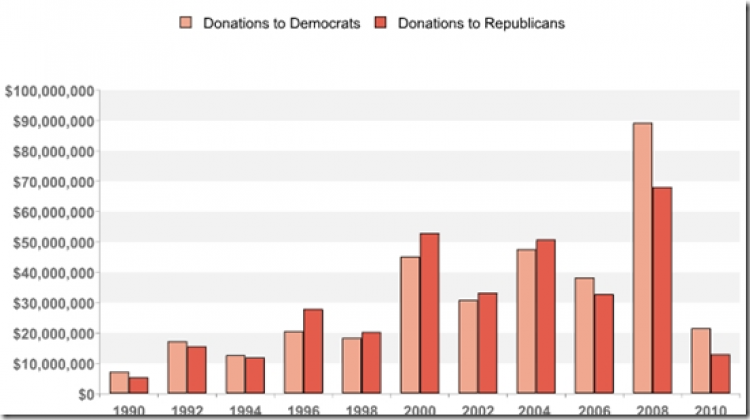
CNN is asking if financial regulation will hurt the Democrats fundraising: They do well with Wall Street, but Democrats may now risk biting the hand that feeds many of them — as President Obama and top party leaders press for financial reform. And a key question arises: will there be a squeeze on the money […]

Read More
Feb 1
2010
obliberalsmall

Unity Won’t Happen If Republicans Keep Lying

Politics

Yesterday on Meet the Press John Boehner continued the same old line that President Obama was the most liberal member of the U.S. Senate. He also seems to be throwing out the idea of ever working together: MR. GREGORY:  Does he have a point? REP. BOEHNER:  No.  If, if you think about what I said, […]

Read More
Jan 2
2010
jl00

The Bush Decade

Economy

The last decade is by no doubt the Bush decade since he held office for 4/5 of it, so the fact that we had zero net job creating during the decade should really stick to his legacy. To put it in visual terms, check out this graph: You can only blame 9/11 for so much […]

Read More
Nov 3
2009
whcritique-20091102

Fox Lied About Their “Ratings Soar”

Misc

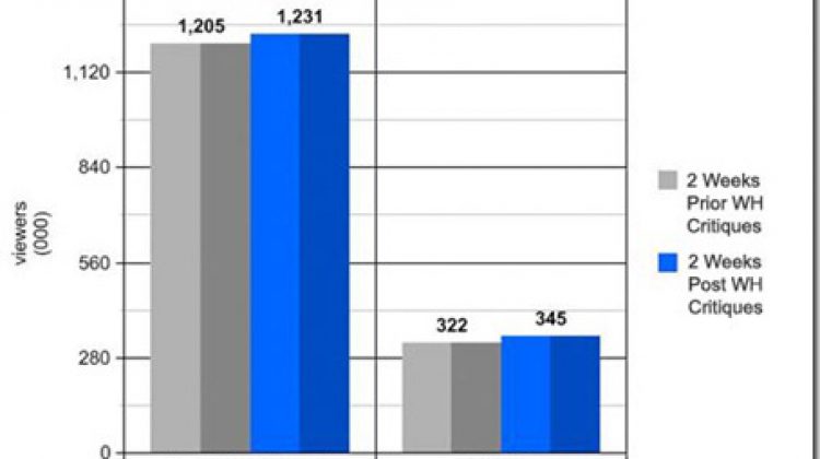
During the entire White House/Fox News feud FOX decided to bolster about their “soaring ratings”. This meme was then picked up by a lot of talking heads in the mainstream media. Media Matters decided to go to the data and see exactly what “soar” meant to FOX: No matter how many times reporters and pundits […]

Read More
Jun 2
2009

SOCIALISM!!!!

Misc

Bob has a nice graph up showing just how much this country has descended into socialism. Talk about scary!!!!

Read More
May 15
2009
qg8phio020orbfpcihagma

A Pro-Life Country?

Misc

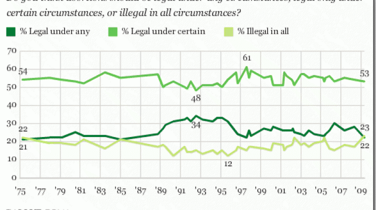
Gallup released a poll today that the right is in love with: A new Gallup Poll, conducted May 7-10, finds 51% of Americans calling themselves “pro-life” on the issue of abortion and 42% “pro-choice.” This is the first time a majority of U.S. adults have identified themselves as pro-life since Gallup began asking this question […]

Read More
Mar 7
2009
bushTerm

Let's Talk Numbers

Misc

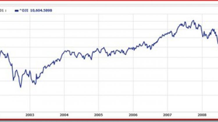
There has been so much talk lately trying to blame the market on Obama. Bob has been keeping track of MSNBC’s usage of a graph tracking the market since election day. So I wonder if the media would mind using some other numbers? DJIA when Bush took office: 10781 DJIA when Bush left office: 7949 […]

Read More
Feb 9
2009
jobsrecessions

Confused

Misc

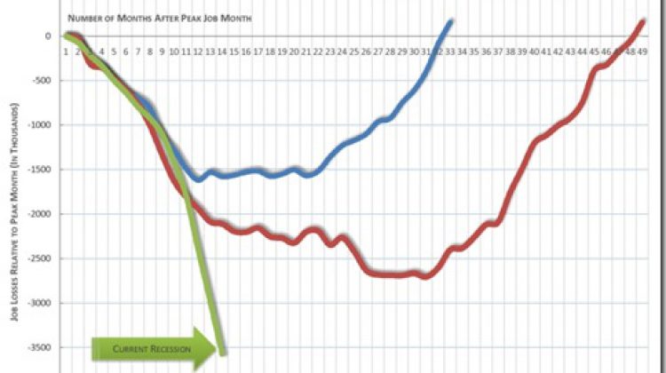
Everyone has had to see this graph by now. It’s the one put out by Nancy Pelosi’s people. The blue line is the 1990 recession, red is 2001 and green is current. Just looking at that you start to comprehend the seriousness of the current financial situation. Now let’s consider this. Republicans attribute the Bush […]

Read More
Newer posts

IntoxiNation

Covering politics, news, media and anything else since 2005.

© 2025 Jamie Holly. Site developed by HollyIT.
Privacy  |  RSS
  • Categories
    • Covid-19
    • Economy
    • Immigration
    • Media
    • Misc
    • National Security
    • News
    • Politics
      • Election 2016
      • Election 2018
      • Election 2020
    • Science
    • Society
      • Hate
    • Uncategorized