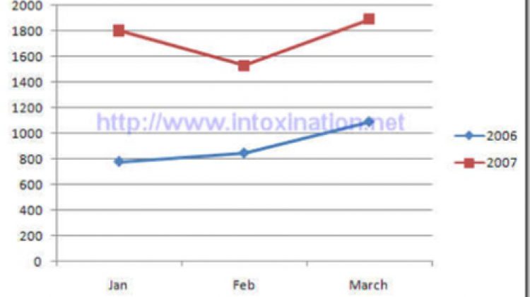
I decided it was time to put the casualty rates of the surge into a graphical representation to see how the surge is actually working. Using numbers from the Iraq Coalition Casualties site, I was able to compile two different graphs. Take the same 3 month period over different years I came up with the […]
Apr 5
2007

