
Time to Examine the "Surge"
I decided it was time to put the casualty rates of the surge into a graphical representation to see how the surge is actually working. Using numbers from the Iraq Coalition Casualties site, I was able to compile two different graphs. Take the same 3 month period over different years I came up with the […]
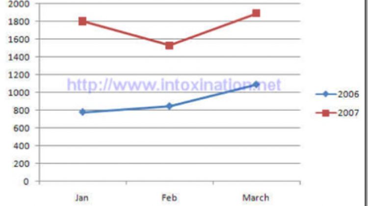
I decided it was time to put the casualty rates of the surge into a graphical representation to see how the surge is actually working. Using numbers from the Iraq Coalition Casualties site, I was able to compile two different graphs. Take the same 3 month period over different years I came up with the following results.

This compares January, February and March of last year to the same months of this year. This graph represents the total number of Iraqi civilian and security forces killed. Unfortunately I could only go back to last year, but the graph is very telling. We see that the number of deaths Iraqi has suffered is on a drastic rise since the “surge”.
Next is the graph of U.S. forces killed in Iraq. I took the same three month sample, but was able to go back to 2004 to compile the data, giving a broader picture.

From this chart we can see that the deaths suffered by U.S. forces have remained constantly higher as compared to previous years. The only time that was surpassed was in January of 2005, when 108 soldiers perished. Just for a little refresher, January 26, 2005 was one of the deadliest days in Iraq, and a helicopter crash claimed 30 lives.
So do we see any improvement yet? The numbers sure don’t show it.