Intoxination

Tag: graph

Jul 1
2007

June's "Surge" Check Up

Misc

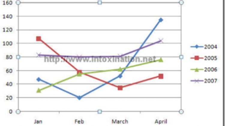
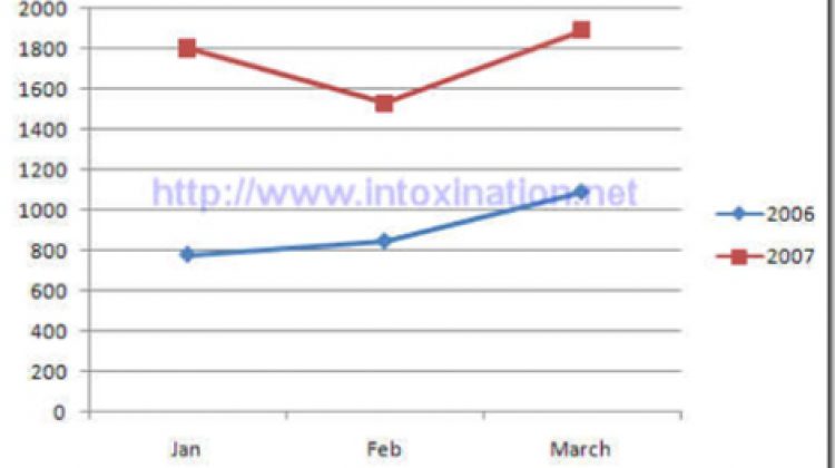
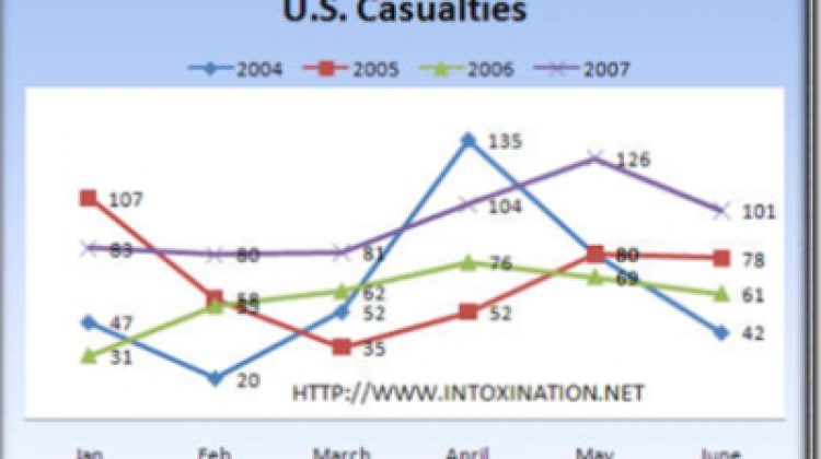
Time again to see how the surge is going in Iraq. This has become a monthly series for me, and a chart makes it so much easier to gauge. First for U.S. casualties. These past three months have been the deadliest three month cycle for U.S. forces since the war began. While June was not […]

Read More
May 1
2007

Surge Comparison For April

Misc

Following up from last month, I decided to add April’s death tolls into the graphs so we can see how the “surge” is working. First off is the U.S. casualty totals With the exception of April 2004, this past April has been the deadliest of all others (including April 2003 when 74 soldiers died). Still […]

Read More
Apr 5
2007

Time to Examine the "Surge"

Misc

I decided it was time to put the casualty rates of the surge into a graphical representation to see how the surge is actually working. Using numbers from the Iraq Coalition Casualties site, I was able to compile two different graphs. Take the same 3 month period over different years I came up with the […]

Read More
Older posts

IntoxiNation

Covering politics, news, media and anything else since 2005.

© 2025 Jamie Holly. Site developed by HollyIT.
Privacy  |  RSS
  • Categories
    • Covid-19
    • Economy
    • Immigration
    • Media
    • Misc
    • National Security
    • News
    • Politics
      • Election 2016
      • Election 2018
      • Election 2020
    • Science
    • Society
      • Hate
    • Uncategorized