
Surge Comparison For April
Following up from last month, I decided to add April’s death tolls into the graphs so we can see how the “surge” is working. First off is the U.S. casualty totals With the exception of April 2004, this past April has been the deadliest of all others (including April 2003 when 74 soldiers died). Still […]
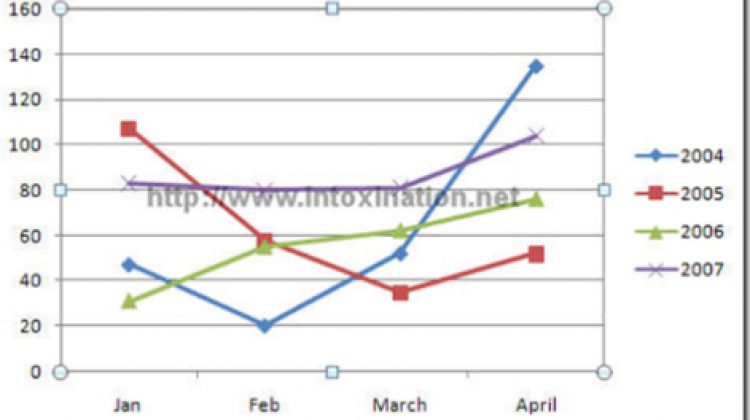
Following up from last month, I decided to add April’s death tolls into the graphs so we can see how the “surge” is working. First off is the U.S. casualty totals

With the exception of April 2004, this past April has been the deadliest of all others (including April 2003 when 74 soldiers died). Still we have an overall higher trend in U.S. deaths in Iraq for 2007.
So how about Iraqi casualties? Well here is that graph:

We are still seeing a lot of Iraqi’s killed. Of course I can’t vouch for the accuracy of this data since we found out the Iraqi government is screwing with it to deflate the numbers. Even with the deflated numbers, things are not going good.
So think about these graphs when the news comes out today that Bush is vetoing the chance for our troops to come home. Also remember that the 90 days Rice and Boehner talked about is now over and the numbers are surging higher. This is the most disgusting face of politics – playing with human lives.