
The Latest WaPo NSA Revelation Opens A Lot Of Questions (UPDATED)
The Washington Post is out with a new article today on the NSA internet snooping: A classified NSA slide obtained by The Washington Post and published here for the first time lists “Two Types of Collection.” One is PRISM, the NSA program that collects information from technology companies, which was first revealed in reports by […]
The Washington Post is out with a new article today on the NSA internet snooping:
A classified NSA slide obtained by The Washington Post and published here for the first time lists “Two Types of Collection.”
One is PRISM, the NSA program that collects information from technology companies, which was first revealed in reports by the Post and Britain’s Guardian newspaper last month. The slide also shows a separate category labeled “Upstream,” described as accessing “communications on fiber cables and infrastructure as data flows past.”
The interaction between Upstream and PRISM — which could be considered “downstream” collection because the data is already processed by tech companies — is not entirely clear from the slide. In addition, its description of PRISM as “collection directly from the servers” of technology giants such as Google, Microsoft and Facebook has been disputed by many of the companies involved. (They say access to user data is legal and limited).
For a bit of global internet primer 101, the world is connected via a huge network of undersea fiber optic cables. These cables, owner and operated by private companies, connect the U.S. to the rest of the world (and the rest of the world to us and each other). You can view an updated map of this enormous network here. Click on the lines and you get detail information, including capacity and owner, on each one.
What the WaPo’s article leads you to believe is that the NSA is directly tapping into these lines. Now overseas connections I can see, but any connection come to or originating from the United States, I couldn’t understand, especially given the fact that these lines do come to shore, in buildings called landing stations, or cable landing points. It would be much easier, if they do infact have a FISA warrant, to go to one of these nice, dry buildings and tap in there, instead of tapping in hundreds of feet underwater.
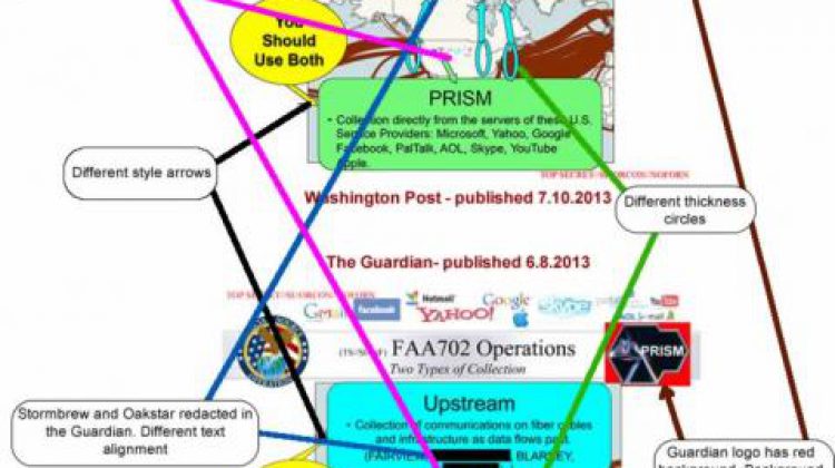
But there’s something else even more interesting. This slide, published by the WaPo, really isn’t anything new. On June 8, the Guardian also published it. Now these slides are from the same source, but if you look at both slides, there are some very telling differences. I’ve gone ahead and made a comparison of the two versions of the slide.

(click for larger view)
As you see there are a number of very noticeable differences between what The Guardian published last month and what the WaPo has published today. The one difference I find most telling is the map in the background.
Take a look at the map on the top slide, which is the Washington Post’s. You have light blue circles, which appear to be symbolic of where Upstream taps. In that, you feel that they are tapping into locations within the continental United States.
Now look at the lower slide, provided by the Guardian. Here you have a flat world map. The circles make you feel there are taps in South America, Africa and one, way out there in the Indian Ocean. Actually that line is called SAFE and has landing points in the following locations:
- Baie Jacotet, Mauritius
- Cochin, India
- Melkbosstrand, South Africa
- Mtunzini, South Africa
- Penang, Malaysia
- Saint Paul, Réunion
Another key difference is the redaction of STORMBREW and OAKSTAR in The Guardian’s slides. What was the purpose of that and were the names redacted on the slides given to The Guardian, or did The Guardian decide to redact them on their own?
These slides raise some serious questions that the media must answer now, like if they came from the same source(s) or not. Playing Devil’s advocate, I can’t help but think that the WaPo’s slides are meant to stoke fear in U.S. citizens, while The Guardians is meant to more so raise concerns of foreigners. This is told by the difference in maps and, ironically, works into the reader base of both publications.
UPDATED (3:30pm)
The logo difference appears to be innocent. These appear to be HTML documents and the Guardian appears to be using Internet Explorer 6 (or older), which doesn’t support transparent PNG files. That’s a reasonable assumption, and one I’ve dealt with for years in the web development world. It’s also evident as other documents I’ve compared between the WaPo and Guardian have the same logo difference.
But while doing this comparison of other slides, I haven’t noticed any others that have the differences between the two sites like this one. One had a change in redaction, which was obviously done by the respective publisher, but outside of that, there have been no other differences. That makes the question of differences on this slide much more interesting.