
A Look At The Obama-mentum
Here is an interesting graphic comparing recent polls in the Democratic primary for the Super Tuesday states (as only Pollster could visualize it): (click for larger view). At first it might look confusing, but it in fact shows a momentum towards Obama. Basically the darker dots are the most recent polls and they go down […]
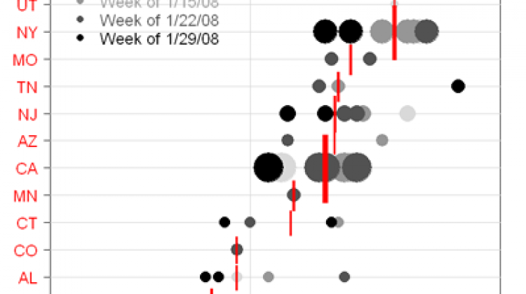
Here is an interesting graphic comparing recent polls in the Democratic primary for the Super Tuesday states (as only Pollster could visualize it):

(click for larger view).
At first it might look confusing, but it in fact shows a momentum towards Obama. Basically the darker dots are the most recent polls and they go down to the lightest being the oldest poll. The darker dots are moving towards the left meaning that Obama is picking up support. Also the diameter of the dots is in relationship to how many delegates that state has.
For even more analysis of this, and a text representation of what’s happening, head on over to Open Left.